Brand Identity System — 2026
Player Six is built for the overlooked — the ones who didn't make the roster, who play by their own rules, who show up anyway. The brand holds a deliberate duality: Is Player Six the quiet outlier who plays for love of the game? Or the one with something to prove? The identity doesn't resolve that tension. It holds both. That ambiguity is the brand.
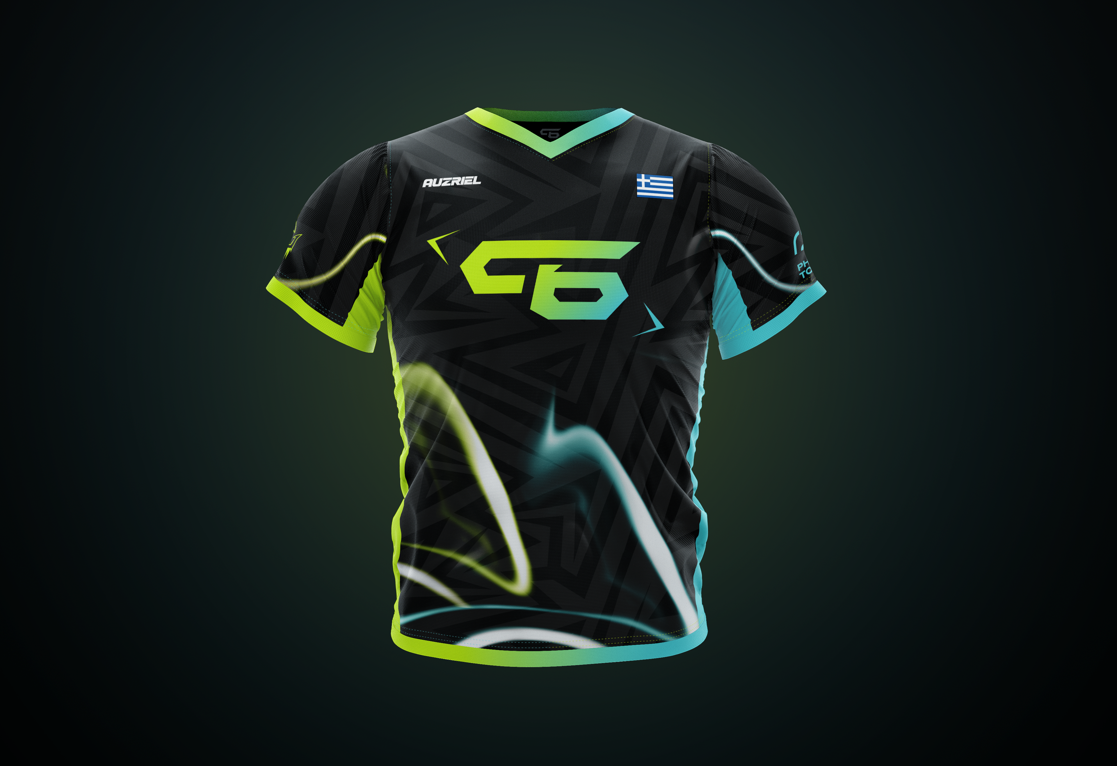
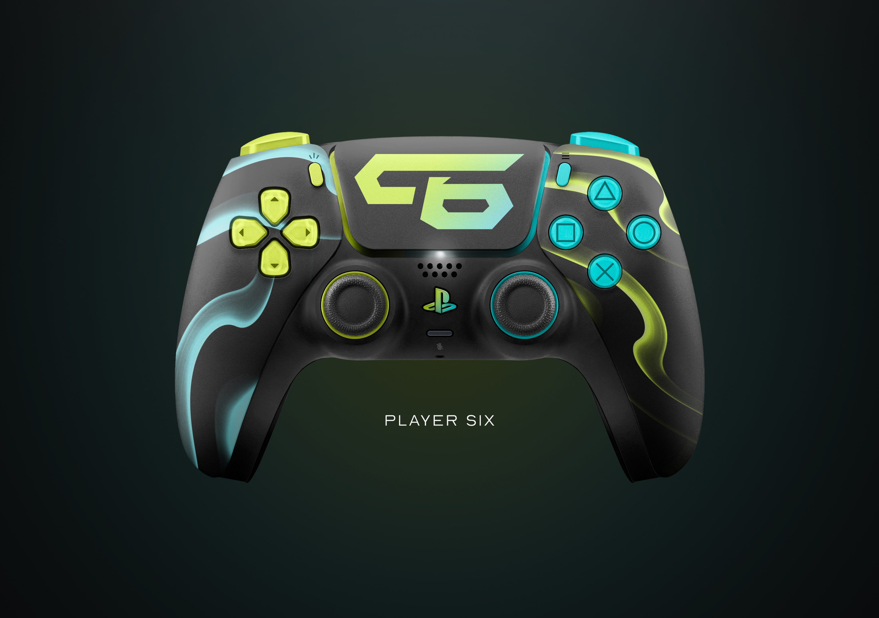
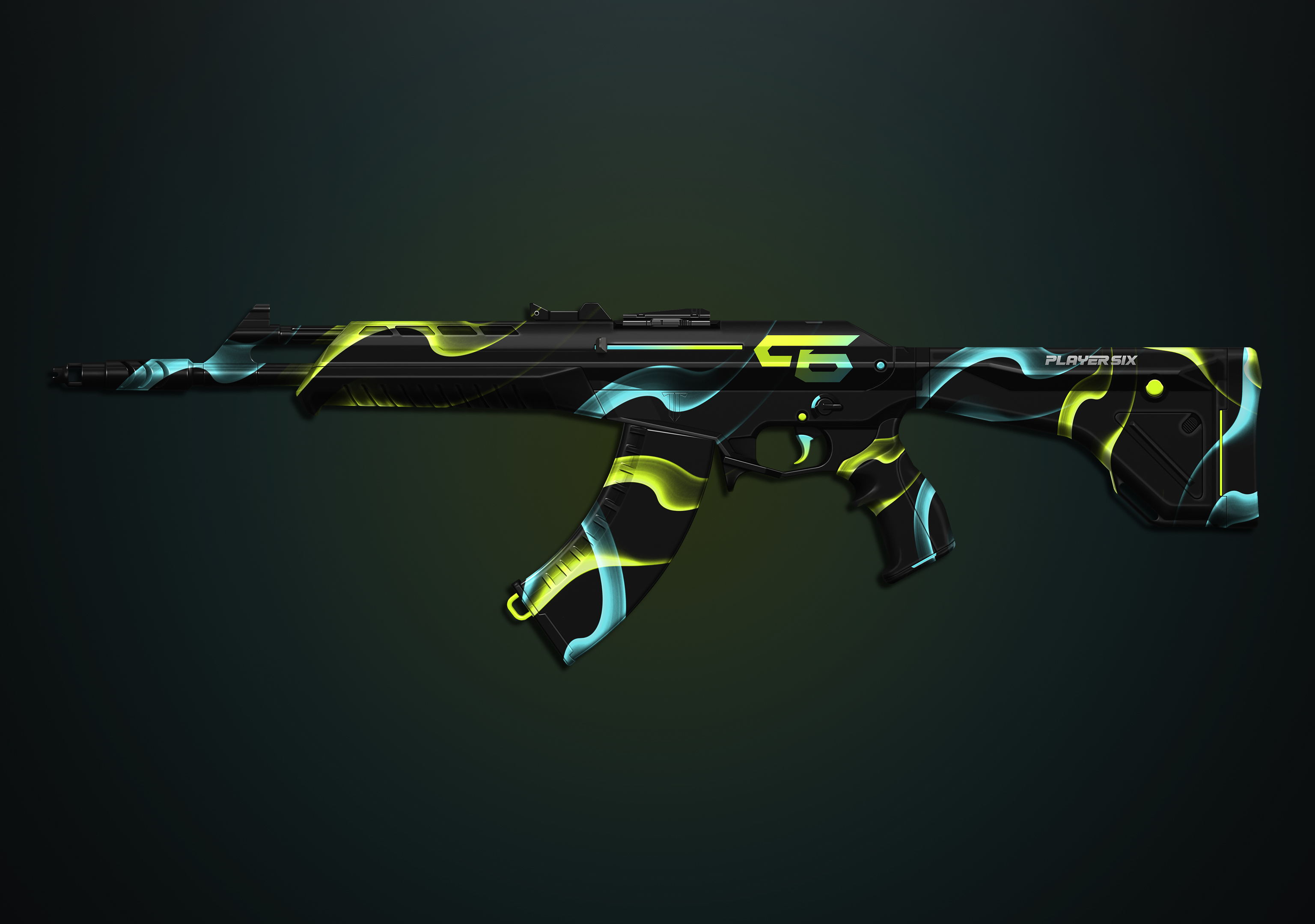
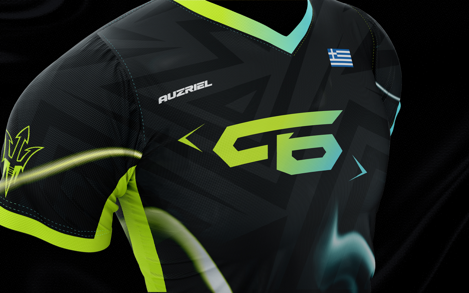
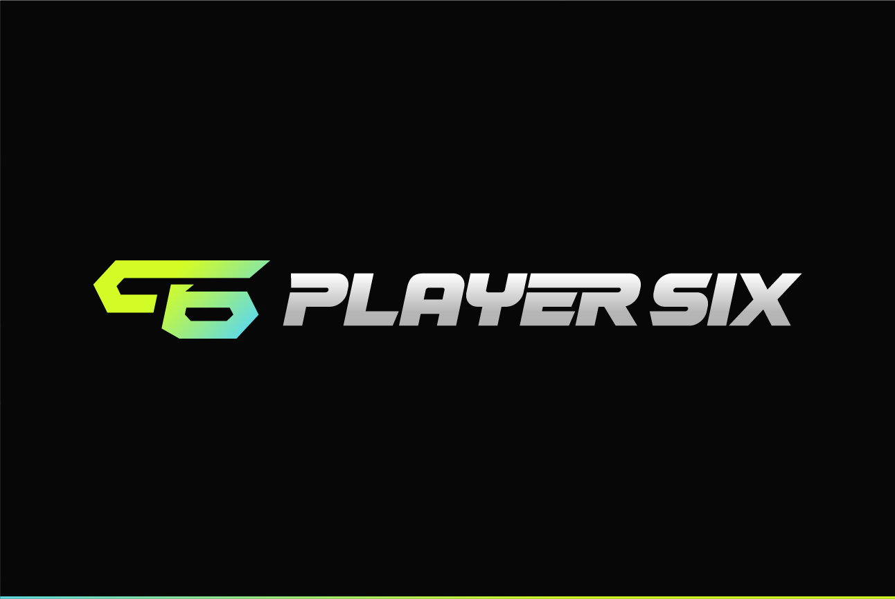
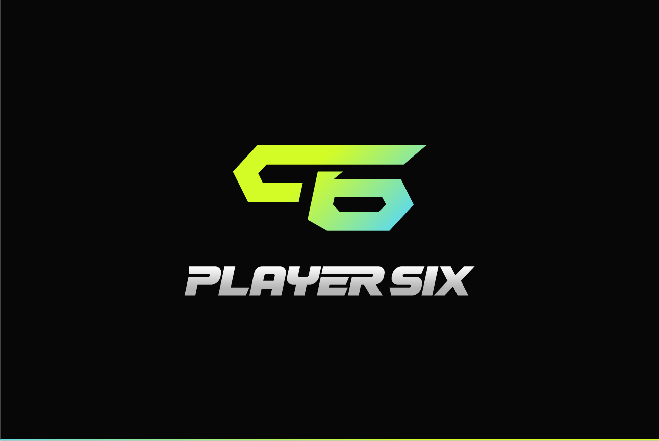
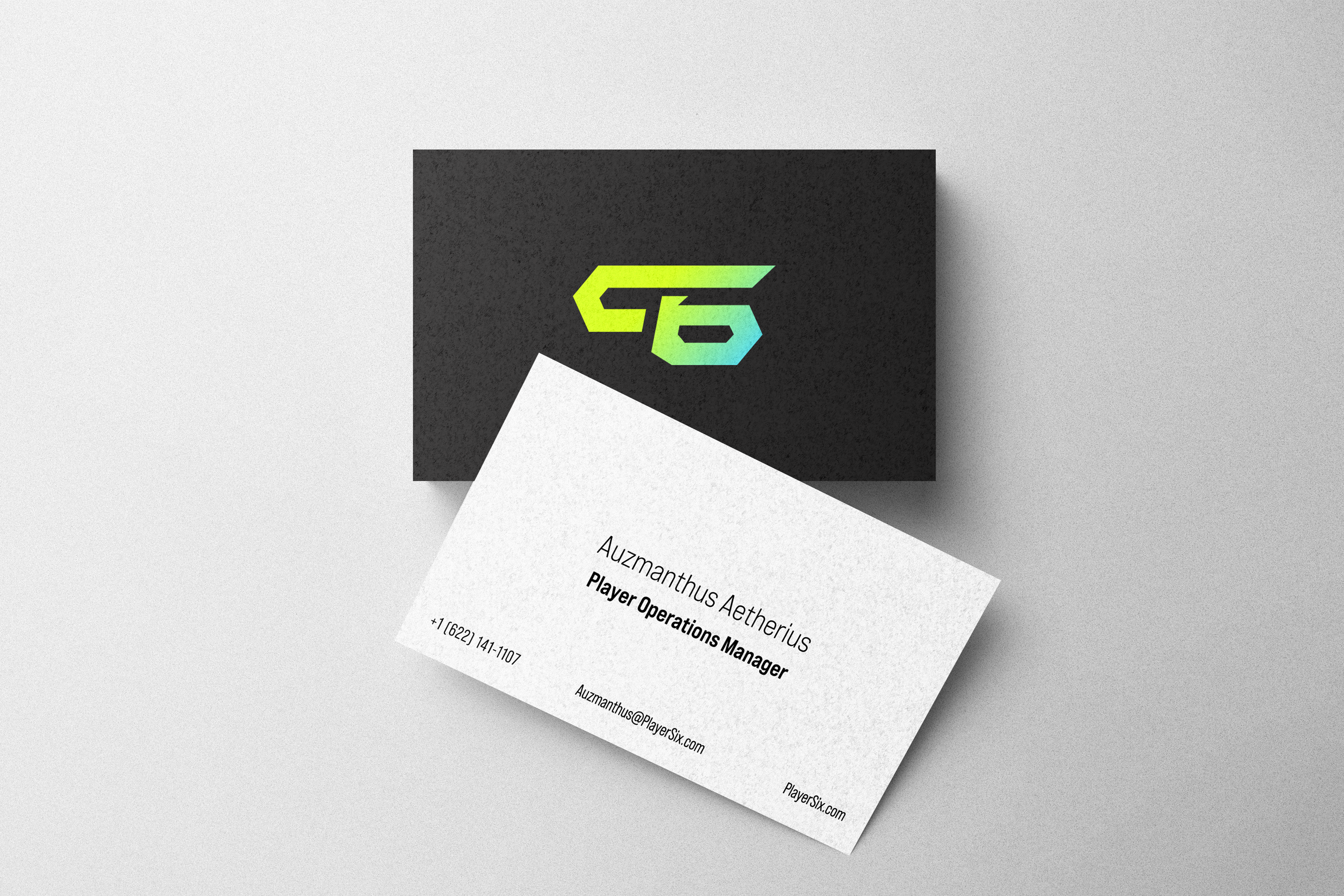
A P and a 6 locked together into a single forward-moving geometric form. Angular, built for speed, leaning into motion. The cyan-to-acid-green gradient isn't decorative — it's the energy of someone about to prove something. The mark works in full color, monochrome white, and monochrome black across any surface.
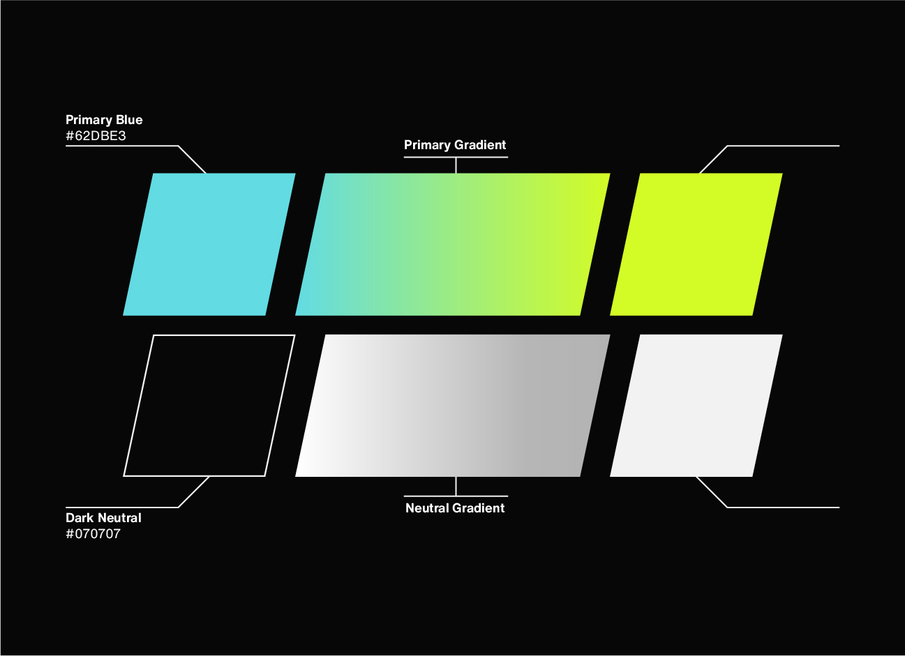
Primary Blue (#62DBE3) to Primary Green (#D3FC26) — the gradient that runs through everything. Dark neutral (#070707) grounds it. The palette is high energy without being aggressive. It pulses.
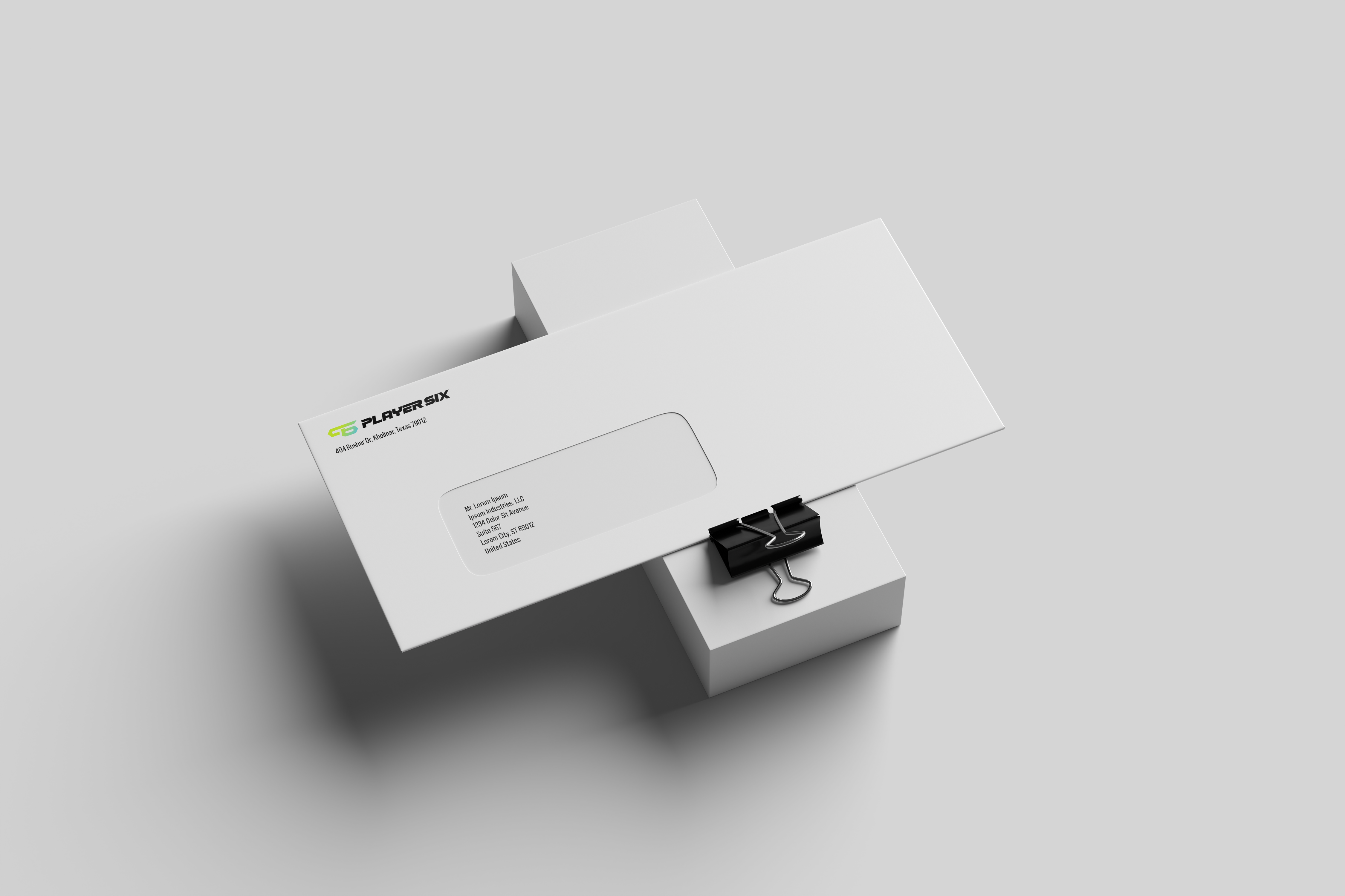
A brand identity for an esports team has to live where the game is played. Player Six extends across every touchpoint — the jersey players wear, the controller in their hands, the weapon skin in their loadout.