Esports Event Campaign — Phantone Studios, 2025
The Tiger Trials is an annual end-of-year esports tournament — Smash Bros., Tekken 8, Street Fighter — run by a college esports program. The visual identity needed to carry the weight of a real production: logo, campaign graphics, talent cards, and results screens, all cohesive and ready to deploy across social media and live broadcast.
The brief had a one-week turnaround. Logo, full campaign, feedback, second rounds — all of it. Version One was built under pressure and delivered on time. A wide horizontal mark — tropical palm fronds spreading outward on either side, a bold curved banner carrying "THE TIGER TRIALS" through the center, a gold crown rising above, a starburst compass anchoring below. Expansive, wild, alive. It held up across every piece of the campaign.
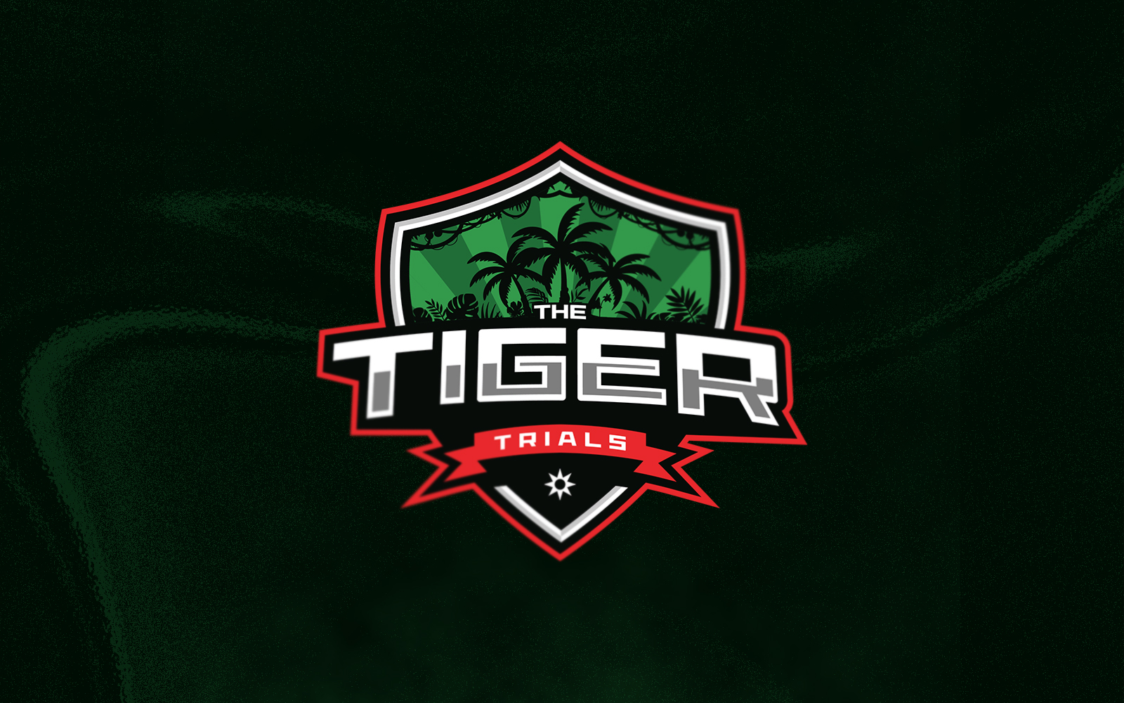
That winter, with no deadline and no brief, I came back to it. The result went in a completely different direction — not bigger, but more controlled. A shield structure housing palm trees and tropical foliage, "TIGER" massive through the center, a ribbon banner anchoring "TRIALS" beneath. Where Version One spreads outward and breathes, Version Two pulls inward and locks in.
Version Two also came with something Version One didn't have time for: a complete brand guidelines system — color palette, typography rules, safe area specifications, correct and incorrect usage, and social media applications. Built on my own time, for a project I cared about finishing properly.
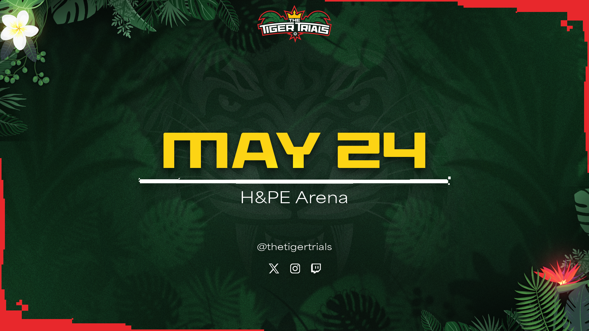
The campaign system spans announcement graphics, game feature cards, talent introductions, and live results screens. Every piece was built within the art direction established for the event — deep forest green, tropical botanicals, bold yellow typography.
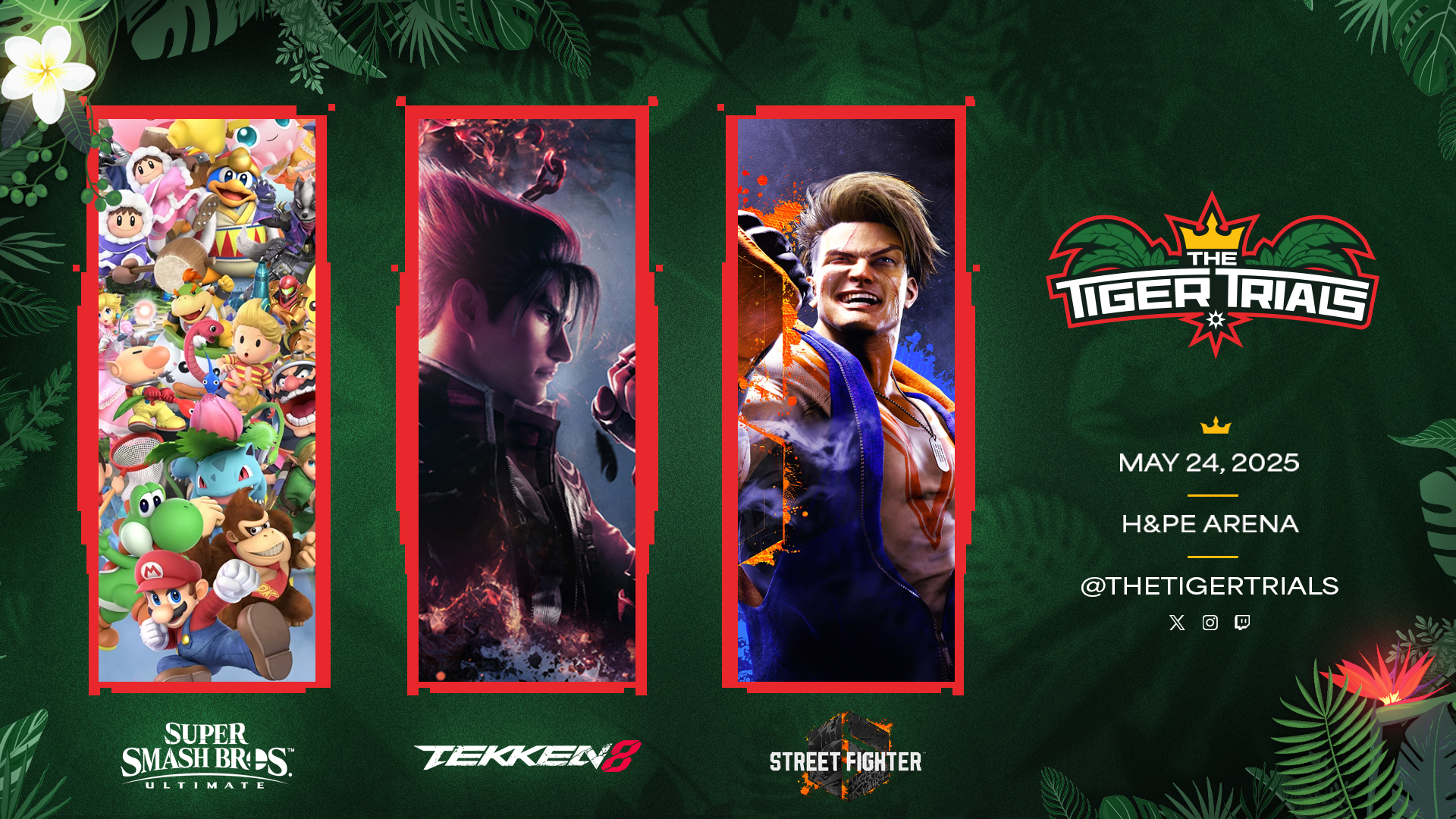
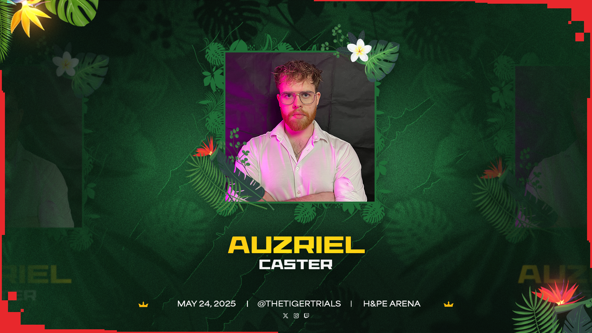
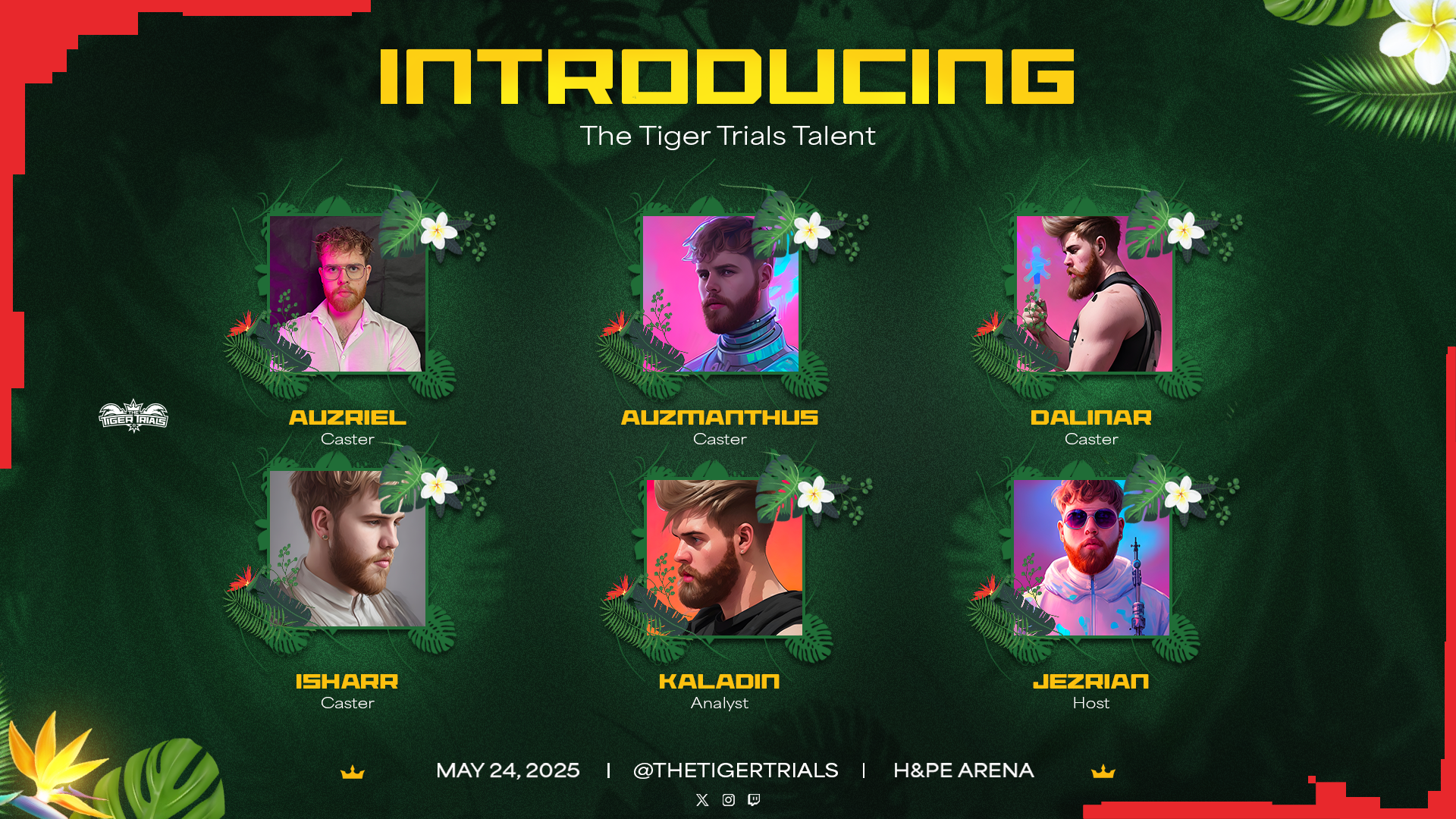
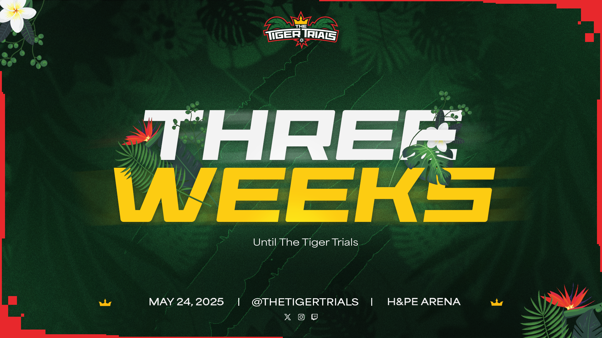
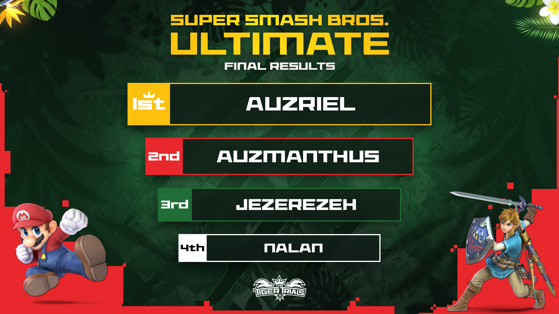
This was a collaborative production. I executed within an art direction established by the studio — and I'd make one call differently in hindsight. The red border treatment on the graphics was intended as a nod to video game aesthetics. I understood the intent, executed it professionally, and delivered on the brief. But my instinct was that the tropical identity we'd built was already doing that work — the jungle, the palm trees in the emblem, the depth of the green. The environment was the world. The border was the first idea, not the best one. That kind of critical reflection is part of how I grow.